Embroidered patch design for

Hope for Hailey

Hope for Hailey is a community initiative centered around supporting a young girl from Connecticut born with a rare condition called cloacal exstrophy. As Hailey prepared for a series of major surgeries and an extended hospital stay, she asked to decorate her hospital room with first responder patches.

Her parents—both first responders themselves—shared the request online. What followed was an overwhelming response from departments around the world, with more than 2,000 patches sent to Hailey as a show of support.

To represent Hailey among the thousands of patches she received, I was asked to design a custom patch created specifically for her. The goal was to capture her personality, symbolize rare disease awareness, and reflect the culture of the first responder community that had rallied around her.

Design

The Story

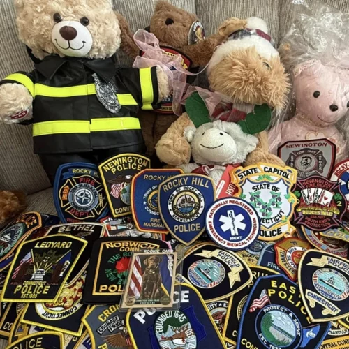
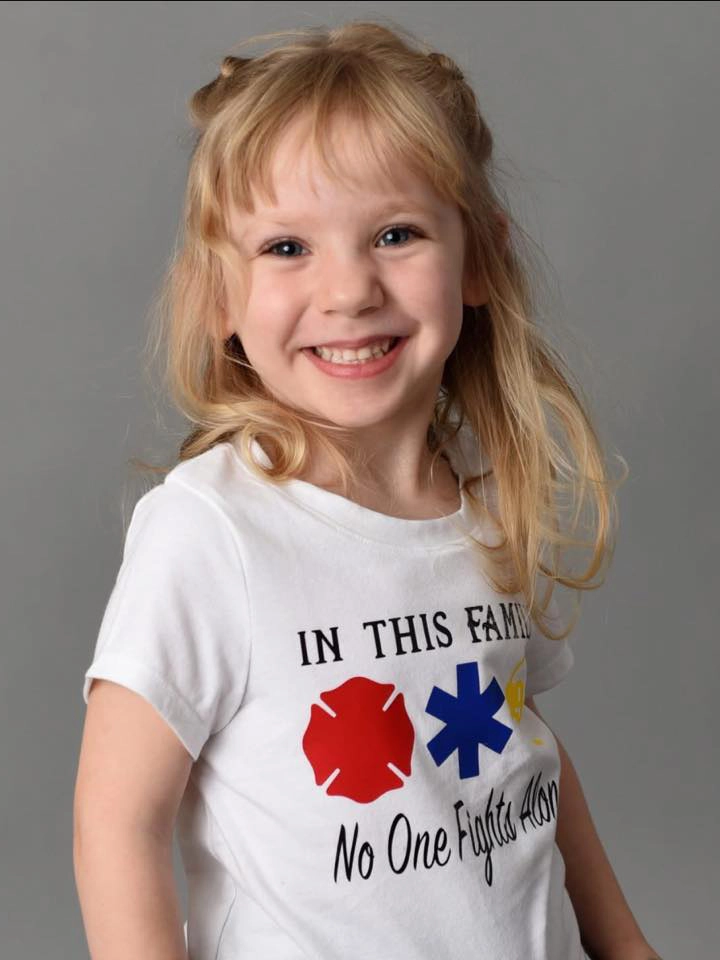
Hailey’s connection to first responder patches was deeply personal. Her father is a firefighter and her mother is a paramedic, and the patches they wore on their uniforms had become something she loved collecting and playing with.

When Hailey mentioned she wanted patches to decorate her hospital room, her parents reached out to fellow first responders online. Within days, patches began arriving from across the country—and eventually from around the world.

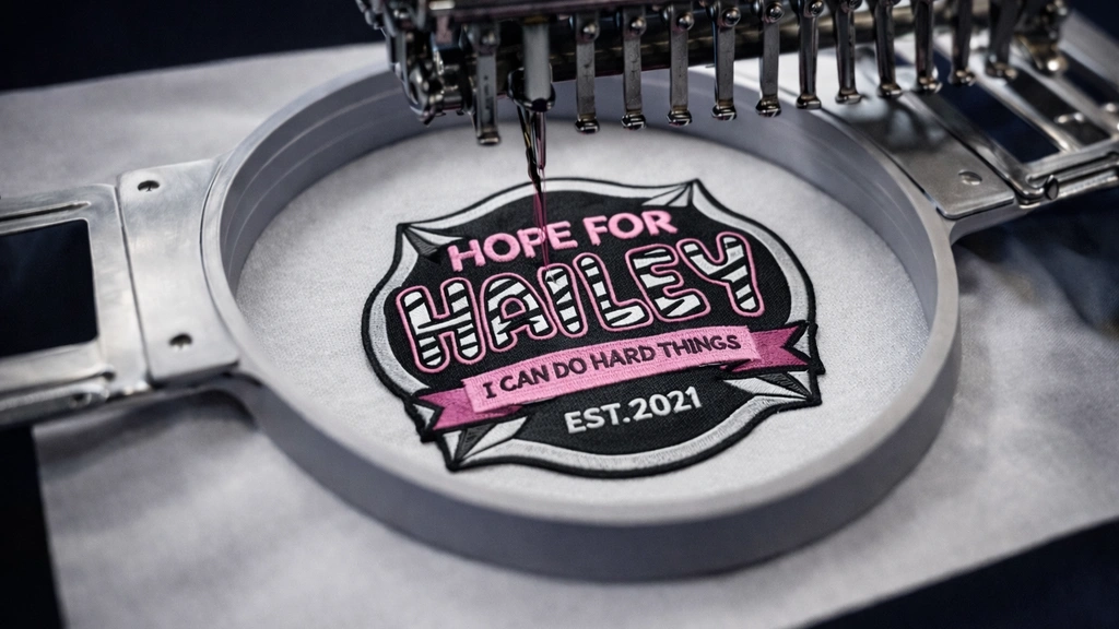
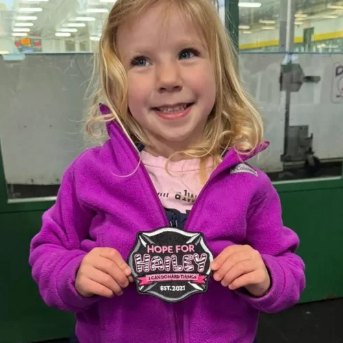
As the collection grew, her parents wanted something that was uniquely hers: a patch designed specifically for Hailey that could sit alongside the thousands she received while representing her story and the strength she showed every day.

The Challenge

The challenge was to design a patch that felt authentic within the visual language of first responder patches while also reflecting Hailey’s personality and message of resilience.

It needed to communicate meaning through symbolism, remain clear and legible when embroidered, and visually fit alongside real patches from fire, EMS, and police departments.

Phase 1

Design Strategy & Concept

Authentic Patch Structure

The design is built on a Maltese cross shield, a shape widely used in firefighter insignia. This instantly connects the patch to the visual language of the first responder community and helps it feel at home alongside real fire, EMS, and police patches.

Rare Disease Awareness

Hailey’s name incorporates a zebra pattern, a symbol commonly used to represent rare diseases. Integrating the pattern directly into the typography connects the design to the broader rare disease community while making it a distinctive focal point.

Personal Meaning

The patch reflects elements that are uniquely Hailey’s. Pink (her favorite color) became the primary visual theme, and her motto “I can do hard things” appears in a banner below the title, reinforcing the message of resilience that defines her story.

Phase 2

Design Breakdown

Color Palette

The color palette was chosen to reflect Hailey’s personality while maintaining strong contrast and clarity for embroidery. Pink—her favorite color—became the dominant visual theme, supported by darker tones that help anchor the design and improve legibility when stitched. Black and white were used not only for contrast but also to support the zebra pattern symbolism tied to rare disease awareness.

Together, the palette balances warmth, visibility, and symbolism while remaining embroidery-friendly.

Typography

The typography combines Bitshow and Winkle, two playful, rounded display fonts that help give the patch a friendly and uplifting tone. Bitshow is used for the main text, “Hailey,” providing a bold and expressive centerpiece that immediately draws attention. Winkle complements it with a softer, more approachable style used for supporting text.

Both fonts feature thick, rounded letterforms that hold up well in embroidered applications, helping maintain clarity when translated from vector artwork to stitched thread. The heavier strokes also work well with the zebra pattern applied to Hailey’s name, allowing the pattern to remain visible without compromising legibility.

Zebra Pattern

The zebra pattern is integrated directly into Hailey’s name, making it the central visual element of the patch.

This choice also carries deeper meaning. The zebra is widely recognized as a symbol of rare disease awareness, inspired by a medical teaching phrase: “When you hear hoofbeats, think horses—but sometimes it’s a zebra.” The idea highlights how rare conditions are often overlooked simply because they are uncommon.

By incorporating the zebra pattern into the typography itself, the design links Hailey’s identity to the broader rare disease community and the awareness it represents.

Symbolism

The design is centered around a Maltese cross, a symbol strongly associated with firefighters and emergency services. The cross represents courage, protection, and service—values reflected in the first responder community supporting Hailey.

It also carries a personal connection. Hailey’s father is a firefighter and her mother is an EMT, making the symbol a natural fit for the patch. Using this familiar emblem helps the design feel authentic among the many patches she received while bringing the other elements of the design together.

Designing for Embroidery

Even though there were no strict limitations for the project, the design was created with embroidery in mind. Drawing on prior experience working with in-house embroidery teams, thin strokes and overly detailed elements were avoided. Letterforms were kept bold, spacing was carefully maintained, and shapes were simplified where needed so the final design would translate cleanly from vector artwork into stitched thread.

Phase 3

Outcome & Impact

The Result

Hailey ultimately received more than 2,000 patches from first responders around the world, creating a powerful reminder that she had an entire community supporting her.

Approximately 450 Hope for Hailey patches were produced and shared with family, friends, and supporters. The design also became the visual identity for fundraising efforts, appearing on shirts, stickers, and promotional materials used to support the initiative.

More importantly, the patch became something uniquely Hailey’s among the thousands she received.

I can tell you it personally meant the world to us, and Hailey says it’s her favorite patch.

Kyra WetmoreHailey’s mother

Key Takeaways

This project is a reminder that design can carry meaning far beyond the visual result. By combining personal symbolism with the familiar visual language of the first responder community, the patch became both a meaningful keepsake and a recognizable symbol of support.

More importantly, it shows how even a small design project can have a real emotional impact when it’s rooted in story, purpose, and community.